10. Matplotlib#
10.1. Overview#
We’ve already generated quite a few figures in these lectures using Matplotlib.
Matplotlib is an outstanding graphics library, designed for scientific computing, with
high-quality 2D and 3D plots
output in all the usual formats (PDF, PNG, etc.)
LaTeX integration
fine-grained control over all aspects of presentation
animation, etc.
10.1.1. Matplotlib’s Split Personality#
Matplotlib is unusual in that it offers two different interfaces to plotting.
One is a simple MATLAB-style API (Application Programming Interface) that was written to help MATLAB refugees find a ready home.
The other is a more “Pythonic” object-oriented API.
For reasons described below, we recommend that you use the second API.
But first, let’s discuss the difference.
10.2. The APIs#
10.2.1. The MATLAB-style API#
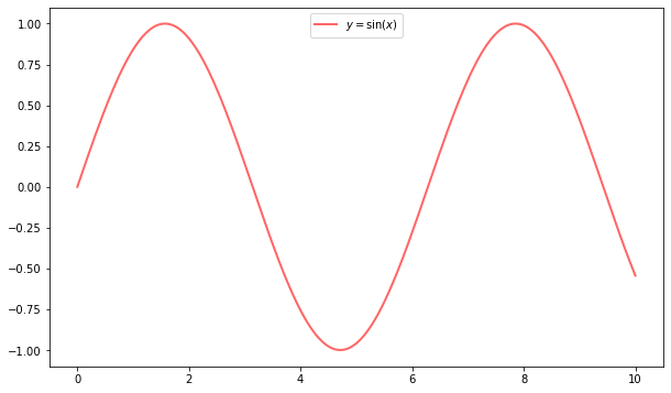
Here’s the kind of easy example you might find in introductory treatments
%matplotlib inline
import matplotlib.pyplot as plt
plt.rcParams["figure.figsize"] = (10, 6) #set default figure size
import numpy as np

x = np.linspace(0, 10, 200)
y = np.sin(x)

plt.plot(x, y, 'b-', linewidth=2)
plt.show()
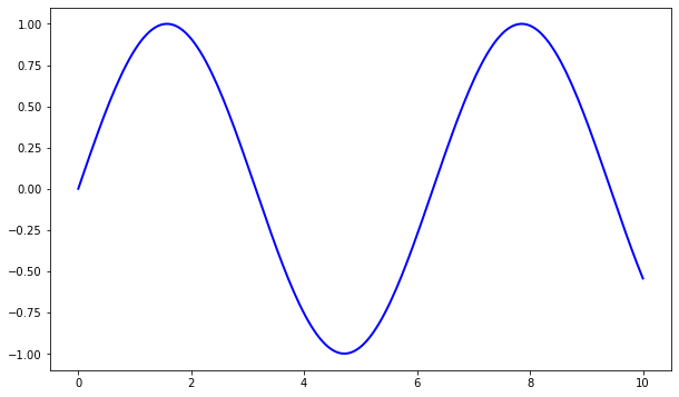
This is simple and convenient, but also somewhat limited and un-Pythonic.
For example, in the function calls, a lot of objects get created and passed around without making themselves known to the programmer.
Python programmers tend to prefer a more explicit style of programming (run import this in a code block and look at the second line).
This leads us to the alternative, object-oriented Matplotlib API.
10.2.2. The Object-Oriented API#
Here’s the code corresponding to the preceding figure using the object-oriented API
fig, ax = plt.subplots()
ax.plot(x, y, 'b-', linewidth=2)
plt.show()
Here the call fig, ax = plt.subplots() returns a pair, where
figis aFigureinstance—like a blank canvas.axis anAxesSubplotinstance—think of a frame for plotting in.
The plot() function is actually a method of ax.
While there’s a bit more typing, the more explicit use of objects gives us better control.
This will become more clear as we go along.
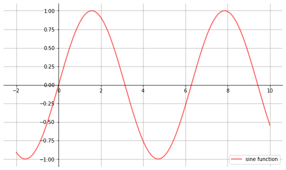
10.2.3. Tweaks#
Here we’ve changed the line to red and added a legend
fig, ax = plt.subplots()
ax.plot(x, y, 'r-', linewidth=2, label='sine function', alpha=0.6)
ax.legend()
plt.show()
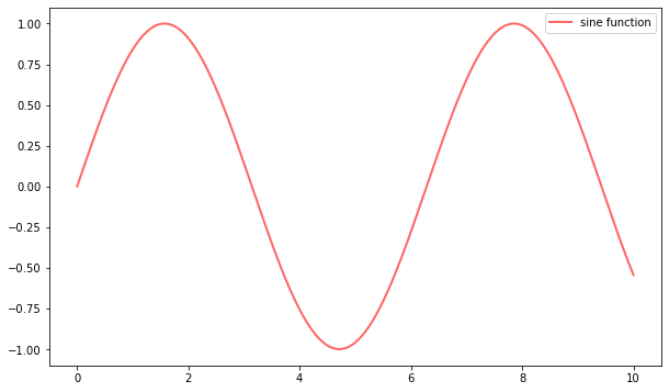
We’ve also used alpha to make the line slightly transparent—which makes it look smoother.
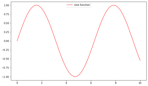
The location of the legend can be changed by replacing ax.legend() with ax.legend(loc='upper center').
fig, ax = plt.subplots()
ax.plot(x, y, 'r-', linewidth=2, label='sine function', alpha=0.6)
ax.legend(loc='upper center')
plt.show()
If everything is properly configured, then adding LaTeX is trivial
fig, ax = plt.subplots()
ax.plot(x, y, 'r-', linewidth=2, label='$y=\sin(x)$', alpha=0.6)
ax.legend(loc='upper center')
plt.show()
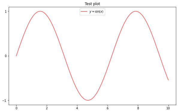
Controlling the ticks, adding titles and so on is also straightforward
fig, ax = plt.subplots()
ax.plot(x, y, 'r-', linewidth=2, label='$y=\sin(x)$', alpha=0.6)
ax.legend(loc='upper center')
ax.set_yticks([-1, 0, 1])
ax.set_title('Test plot')
plt.show()
10.3. More Features#
Matplotlib has a huge array of functions and features, which you can discover over time as you have need for them.
We mention just a few.
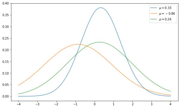
10.3.1. Multiple Plots on One Axis#
It’s straightforward to generate multiple plots on the same axes.
Here’s an example that randomly generates three normal densities and adds a label with their mean
from scipy.stats import norm
from random import uniform

fig, ax = plt.subplots()
x = np.linspace(-4, 4, 150)
for i in range(3):
    m, s = uniform(-1, 1), uniform(1, 2)
    y = norm.pdf(x, loc=m, scale=s)
    current_label = f'$\mu = {m:.2}$'
    ax.plot(x, y, linewidth=2, alpha=0.6, label=current_label)
ax.legend()
plt.show()
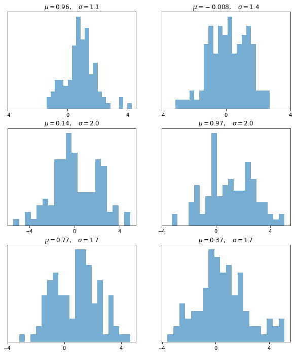
10.3.2. Multiple Subplots#
Sometimes we want multiple subplots in one figure.
Here’s an example that generates 6 histograms
num_rows, num_cols = 3, 2
fig, axes = plt.subplots(num_rows, num_cols, figsize=(10, 12))
for i in range(num_rows):
    for j in range(num_cols):
        m, s = uniform(-1, 1), uniform(1, 2)
        x = norm.rvs(loc=m, scale=s, size=100)
        axes[i, j].hist(x, alpha=0.6, bins=20)
        t = f'$\mu = {m:.2}, \quad \sigma = {s:.2}$'
        axes[i, j].set(title=t, xticks=[-4, 0, 4], yticks=[])
plt.show()
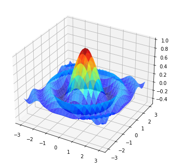
10.3.3. 3D Plots#
Matplotlib does a nice job of 3D plots — here is one example
from mpl_toolkits.mplot3d.axes3d import Axes3D
from matplotlib import cm


def f(x, y):
    return np.cos(x**2 + y**2) / (1 + x**2 + y**2)

xgrid = np.linspace(-3, 3, 50)
ygrid = xgrid
x, y = np.meshgrid(xgrid, ygrid)

fig = plt.figure(figsize=(10, 6))
ax = fig.add_subplot(111, projection='3d')
ax.plot_surface(x,
                y,
                f(x, y),
                rstride=2, cstride=2,
                cmap=cm.jet,
                alpha=0.7,
                linewidth=0.25)
ax.set_zlim(-0.5, 1.0)
plt.show()
10.3.4. A Customizing Function#
Perhaps you will find a set of customizations that you regularly use.
Suppose we usually prefer our axes to go through the origin, and to have a grid.
Here’s a nice example from Matthew Doty of how the object-oriented API can be used to build a custom subplots function that implements these changes.
Read carefully through the code and see if you can follow what’s going on
def subplots():
    "Custom subplots with axes through the origin"
    fig, ax = plt.subplots()

    # Set the axes through the origin
    for spine in ['left', 'bottom']:
        ax.spines[spine].set_position('zero')
    for spine in ['right', 'top']:
        ax.spines[spine].set_color('none')

    ax.grid()
    return fig, ax


fig, ax = subplots()  # Call the local version, not plt.subplots()
x = np.linspace(-2, 10, 200)
y = np.sin(x)
ax.plot(x, y, 'r-', linewidth=2, label='sine function', alpha=0.6)
ax.legend(loc='lower right')
plt.show()
The custom subplots function
calls the standard
plt.subplotsfunction internally to generate thefig, axpair,makes the desired customizations to
ax, andpasses the
fig, axpair back to the calling code.
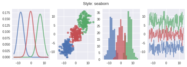
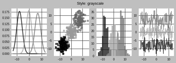
10.3.5. Style Sheets#
Another useful feature in Matplotlib is style sheets.
We can use style sheets to create plots with uniform styles.
We can find a list of available styles by printing the attribute plt.style.available
print(plt.style.available)
['Solarize_Light2', '_classic_test_patch', '_mpl-gallery', '_mpl-gallery-nogrid', 'bmh', 'classic', 'dark_background', 'fast', 'fivethirtyeight', 'ggplot', 'grayscale', 'seaborn', 'seaborn-bright', 'seaborn-colorblind', 'seaborn-dark', 'seaborn-dark-palette', 'seaborn-darkgrid', 'seaborn-deep', 'seaborn-muted', 'seaborn-notebook', 'seaborn-paper', 'seaborn-pastel', 'seaborn-poster', 'seaborn-talk', 'seaborn-ticks', 'seaborn-white', 'seaborn-whitegrid', 'tableau-colorblind10']
We can now use the plt.style.use() method to set the style sheet.
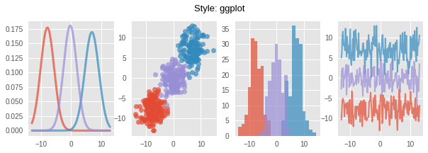
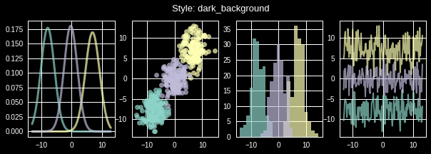
Let’s write a function that takes the name of a style sheet and draws different plots with the style
def draw_graphs(style='default'):

    # Setting a style sheet
    plt.style.use(style)

    fig, axes = plt.subplots(nrows=1, ncols=4, figsize=(10, 3))
    x = np.linspace(-13, 13, 150)

    # Set seed values to replicate results of random draws
    np.random.seed(9)

    for i in range(3):

        # Draw mean and standard deviation from uniform distributions
        m, s = np.random.uniform(-8, 8), np.random.uniform(2, 2.5)

        # Generate a normal density plot
        y = norm.pdf(x, loc=m, scale=s)
        axes[0].plot(x, y, linewidth=3, alpha=0.7)

        # Create a scatter plot with random X and Y values
        # from normal distributions
        rnormX = norm.rvs(loc=m, scale=s, size=150)
        rnormY = norm.rvs(loc=m, scale=s, size=150)
        axes[1].plot(rnormX, rnormY, ls='none', marker='o', alpha=0.7)

        # Create a histogram with random X values
        axes[2].hist(rnormX, alpha=0.7)

        # and a line graph with random Y values
        axes[3].plot(x, rnormY, linewidth=2, alpha=0.7)

    plt.suptitle(f'Style: {style}', fontsize=13)
    plt.show()
Let’s see what some of the styles look like.
First, we draw graphs with the style sheet seaborn
draw_graphs(style='seaborn')
We can use grayscale to remove colors in plots
draw_graphs(style='grayscale')
Here is what ggplot looks like
draw_graphs(style='ggplot')
We can also use the style dark_background
draw_graphs(style='dark_background')
You can use the function to experiment with other styles in the list.
If you are interested, you can even create your own style sheets.
10.4. Further Reading#
The Matplotlib gallery provides many examples.
A nice Matplotlib tutorial by Nicolas Rougier, Mike Muller and Gael Varoquaux.
mpltools allows easy switching between plot styles.
Seaborn facilitates common statistics plots in Matplotlib.
10.5. Exercises#
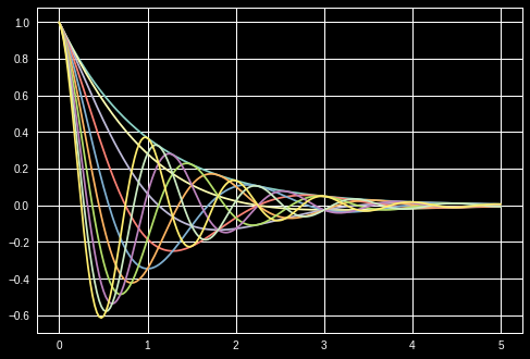
Exercise 10.1
Plot the function
over the interval \([0, 5]\) for each \(\theta\) in np.linspace(0, 2, 10).
Place all the curves in the same figure.
The output should look like this
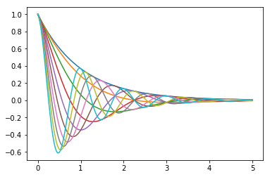
Solution to Exercise 10.1
Here’s one solution
def f(x, θ):
    return np.cos(np.pi * θ * x ) * np.exp(- x)

θ_vals = np.linspace(0, 2, 10)
x = np.linspace(0, 5, 200)
fig, ax = plt.subplots()

for θ in θ_vals:
    ax.plot(x, f(x, θ))

plt.show()